CEX's new website...

Posted 25th Oct 2023
...is absolutely horrendous. What an absolute turd. Whoever is in charge of UX and UI needs to be sacked. How on earth that got signed off, I have no idea.

Instead of being able to see on one page how much they sell / buy for, it's just a confusing mess.

Example:
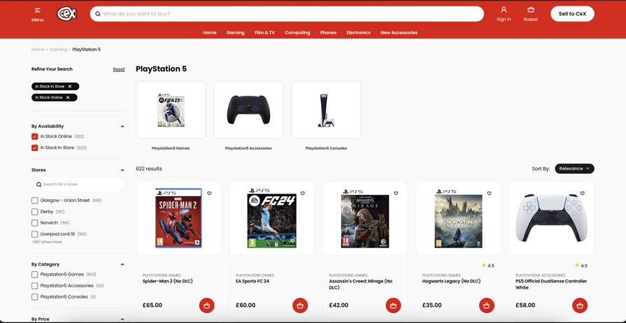
4222852-hBsm9.jpg
Community Updates
New Comment

Categories

19 Comments

sorted by
's avatar
  1. Gollywood's avatar
    The original one was pretty useless
    sm9690's avatar
    Author
    It was very 00's-esque but at least it had some decent functions. The new search bar doesn't show any product prices at all. Previously you used to be able to type a product and it show you the buy price and sell for cash/voucher price. Now nothing, just text.
  2. h82think's avatar
    51265409-0AQ5b.jpg
    Oh dear.
  3. Onlydongles's avatar
    Its their tribute to Halloween !
  4. BabiDealings's avatar
    Yeah it is absolutely horrible, even when I check specific categories there are items missing. The search doesn’t locate items, you have to use Google to find certain games/accessories. You have to go through numerous additional clicks to get anywhere. I honestly don’t think I could ever eventually get used to this rubbish lol.

    The previous website was poor, but it was 10x better than this pile of
  5. kos1c's avatar
    Looks like the old game sore but not in purple.
  6. PS5's avatar
    Use the toggle on the site to switch from buy to sell..
  7. Sonofclara's avatar
    Was using the old version till about 5 minutes ago doesn't this one have a dark mode
  8. Attic45's avatar
    You are on the buy section. Toggle to the sell section and to be honest, having just searched for various things I want to sell I think it is a vast improvement then before. (edited)
    BabiDealings's avatar
    I have no idea if you are joking or not lol, as I have never used a website soo bad
  9. h82think's avatar
    I figured it out...
    51265427-TEh9c.jpg
  10. McShane's avatar
    Just tried it out, searched for something to sell, first result is what I searched, it told me the price.

    If it does all that just fine I couldn't care what it looks like.
  11. Pájaro's avatar
    In fairness, it seems to have fixed my biggest issue with the site, which was the way it tried to search anew and half-heartedly reload the page with every extra key entered into the search box. Seems a lot better in that regard, although it still seems pretty iffy in others. Like, why are PC monitors listed under Electronics, not Computing? And who thought it would be a good idea for items to turn squint when you mouseover them, instead of highlighting the normal way?
  12. Pricklerickle's avatar
    Seems built for blind too chunky, there irrated me last week when I found out it was 3 pound delivery for a dvd and I wanna order ten
  13. Misslovely's avatar
    Delivery used to be free for £100 now they charge you
    InfoAddict's avatar
    Sounds like Mike Ashley got a hold of them on the sly. (edited)
  14. C0mm0d0re_K1d's avatar
    It seems to be the current trend. A lot of sites are overly cumbersome and don't work correctly. Especially when searching. Like Amazon showing things not related to what you search for. It's was bad before.
  15. Wongy111's avatar
    Terrible only for Ken
    51284270-wzxjI.jpg
's avatar
Top Merchants